Transforming a 43-pyeong (approx. 1,500 sq ft) apartment in Korea, like the Icheon Station Hyundai Home Town example, involves strategic expansion across six key areas. This 2026 guide focuses on maximizing space and optimizing flow, incorporating elements like new outdoor unit rooms and system air conditioners. For comprehensive renovations, consulting with interior design experts is crucial to balance aesthetics with structural integrity and functionality.
What Are the 6 Key Expansion Zones for Enhanced Home Comfort?
This 43-pyeong apartment renovation prioritized structural solutions over purely aesthetic changes. The project involved expanding six distinct zones, installing six system air conditioners, and constructing a new outdoor unit room. Significant effort was dedicated to efficiently reorganizing the internal structure to optimize living flow. The goal wasn't just to enlarge the space, but to meticulously analyze which areas could be expanded to enhance resident convenience. By strategically reducing underutilized spaces and opening up previously confined areas, the selective expansion across these six zones maximized the overall utility of the apartment. This process redefined the entire home's balance and flow, creating a more harmonious living environment.
How to Design Entrances, Hallways, and Living Areas for First Impressions and Flow?
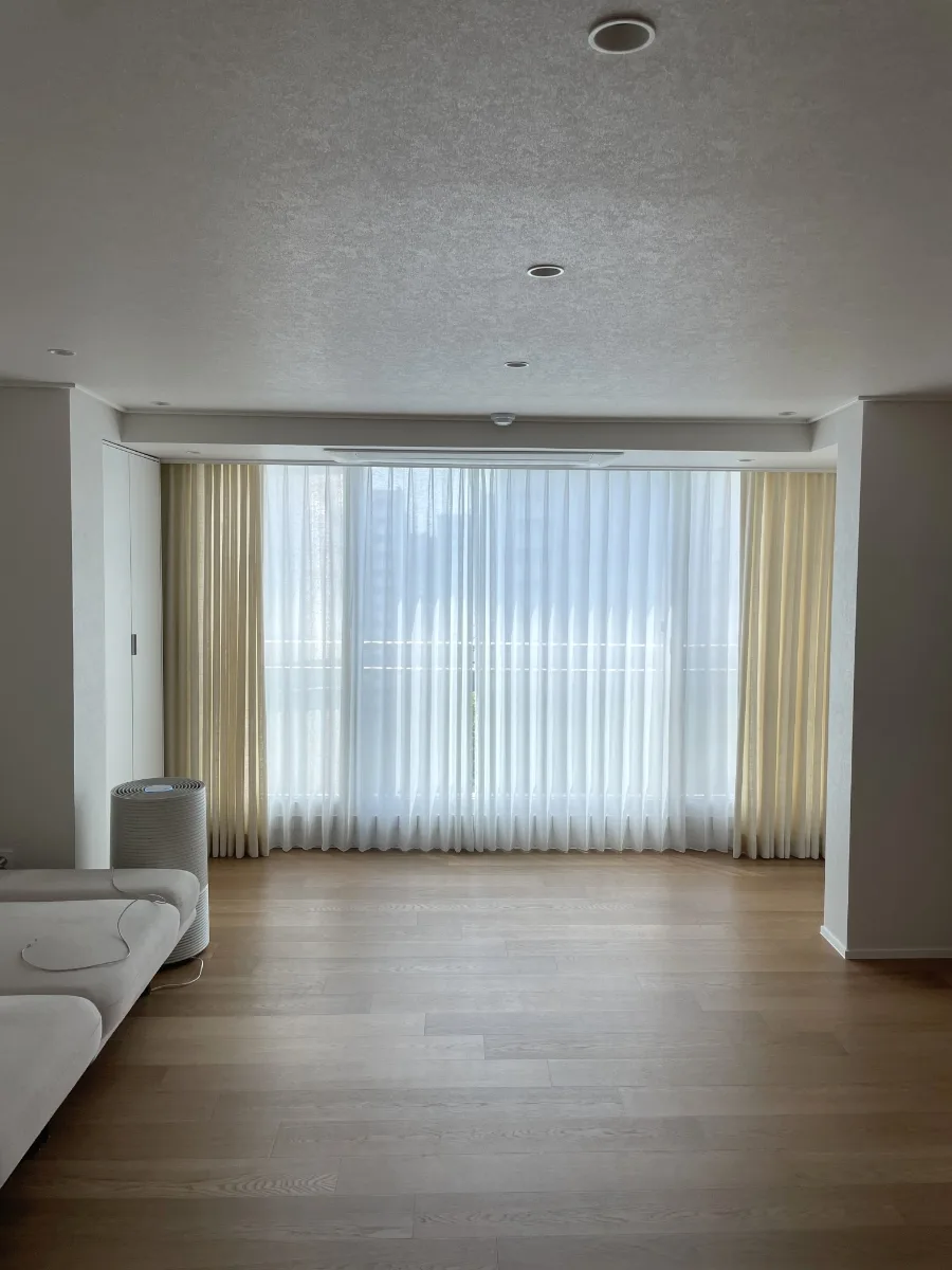
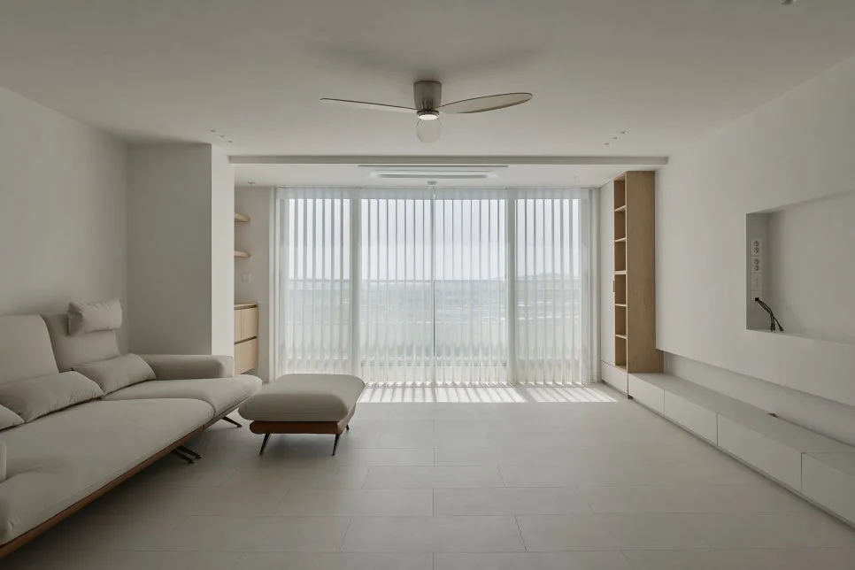
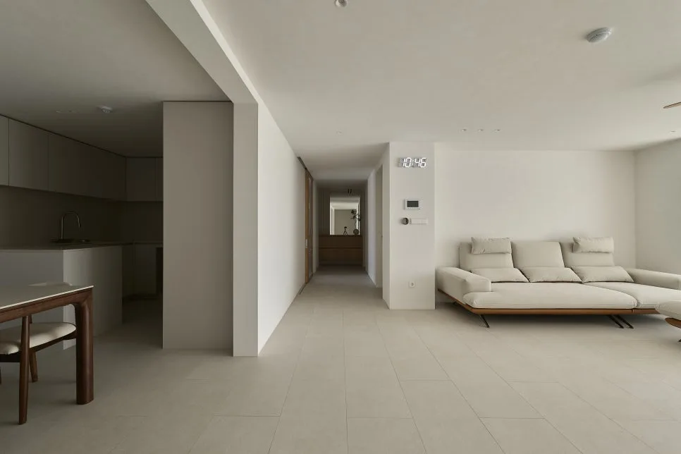
The entryway was designed with practical use in mind, prioritizing function over mere aesthetics. A long, integrated bench serves not only as a design element but also enhances usability. The mirror is seamlessly integrated into the wall, creating an illusion of continuous space and making the area feel more expansive. Lighting is subtle, following the floor and walls to add depth rather than highlighting specific spots. The hallway and middle door act as visual dividers rather than solid barriers. A design combining wooden frames and glass separates spaces without feeling claustrophobic, allowing sightlines to naturally extend to the end of the hallway. The living room embraces an aesthetic of intentional emptiness. Instead of filling the expanded space with furniture, ample negative space was preserved. By unifying the tones of the walls, floor, and furniture, the overall density of the space was subtly and stably managed. The focus was on maintaining a minimal sense of balance, creating a comfortable and open atmosphere.
What are the Space Utilization Strategies for Kitchens, Master Bedrooms, and Kids' Rooms?
The kitchen renovation focused on streamlining actual usage patterns rather than complex structural changes. The layout was optimized to simplify the cooking workflow, and under-cabinet lighting was added to create a comfortable ambiance beyond just the preparation area. Considering the master bedroom is a space for extended stays, a more detailed design approach was applied. The expanded section features a raised platform, naturally separating the sleeping area from the relaxation zone. Built-in storage along the walls ensures a clutter-free and organized space. The children's room was designed with future adaptability in mind, rather than just the present. Soft light from the expanded area provides a calming environment for the child, and ample free space was allocated considering potential furniture rearrangements. Subtle, eye-fatiguing lighting and a neutral color palette offer flexibility for the room to transition from a play area to a study space. Each area was designed considering the residents' lifestyles and potential future changes.
How to Achieve Both Functionality and Aesthetics in Workspaces, Bonus Rooms, and Bathrooms?
The workspace (Room C) was kept intentionally simple to enhance concentration. Desk placement was considered to maximize natural light from the window, and the walls were kept as bare as possible to avoid visual distraction. A key feature of this space is the hidden outdoor unit room within the built-in wardrobe. Applying a turning door makes it easy to seal and maintain, minimizing external elements to avoid disrupting the indoor space's flow. Although used as a study, it's a room for prolonged stays, so functional elements are concealed, and the living area remains neat. The bonus room (Room D) focuses on emptiness for comfortable use when needed. A built-in wardrobe along one wall provides ample storage while its simple design prevents the space from feeling cramped. Both bathrooms prioritize user experience. The master bathroom features textured tiles for a stable, grounded feel and a wall-mounted vanity to enhance the sense of openness. The shared bathroom includes a bathtub for both showering and soaking, using a similar tile palette to the first bathroom but with a softer tone for a more relaxed feel. Both bathrooms were designed to be timeless and aesthetically pleasing for long-term enjoyment.
English crawl path
Next English reads from this pilot cluster
Continue through the category hub, latest English stories, and related posts so this translated article is not an isolated URL.
Tags
💬Frequently Asked Questions
What should I check first in Korean Apartment Interior Design: 6-Section Expansion Guide 2026?
Does this Home & Interior article link back to the Korean source?
Where can I find similar English stories?
English discovery path
Explore more English K-culture stories
Keep browsing the indexed English pilot cluster so Google and readers can move between this story, the category hub, and fresh discovery pages.
Original Source
Read the Korean original